Black and Grey Tattoos in Cape Town
Shading, contrast and structure without colour — the backbone of everything I tattoo at TOMB Tattoo.
Black and grey is where I have spent most of the last fifteen years. Working without colour strips a design back to the things that actually carry it: the weight of the linework, the way light falls across a shape, and how much breathing room sits between one element and the next. A piece that reads clearly across a room usually has fewer decisions in it, not more.
In practice that means building tone in slow, controlled passes — soft greys pulled out of solid black, stippled texture where a surface needs grain, and clean outlines holding the whole thing together. Portraits, animals, religious imagery, vintage photographs and objects with a bit of history behind them all suit this approach, because the subject is already doing the storytelling.
Every design is drawn for the person wearing it and for the part of the body it sits on. A chest piece wants a different rhythm to a forearm, and a hand tattoo has to survive years of wear, so the line weight and spacing get adjusted accordingly. If you arrive with a loose idea, a handful of references or nothing but a feeling, we work it into something that fits you rather than forcing a stock design onto your skin.
Ages well is the goal. Black and grey tends to settle in beautifully when it has been built with enough contrast from the start, which is why I would rather simplify a busy concept now than watch it close up over time. That conversation happens before any needle comes out, usually over a first enquiry and a follow-up chat about size, placement and how many sessions the piece realistically needs.
I tattoo from TOMB Tattoo in Cape Town. Send through your idea and we will take it from there.
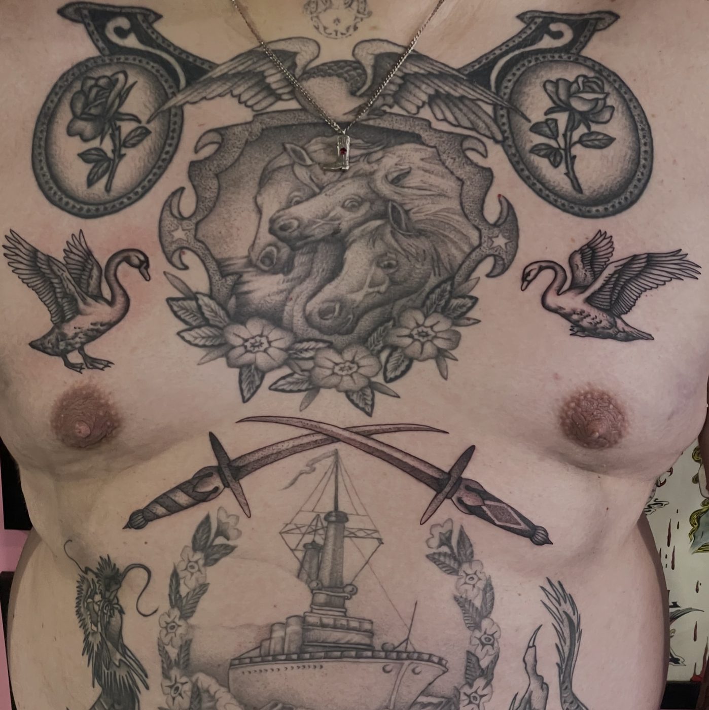
Horse crest chest piece 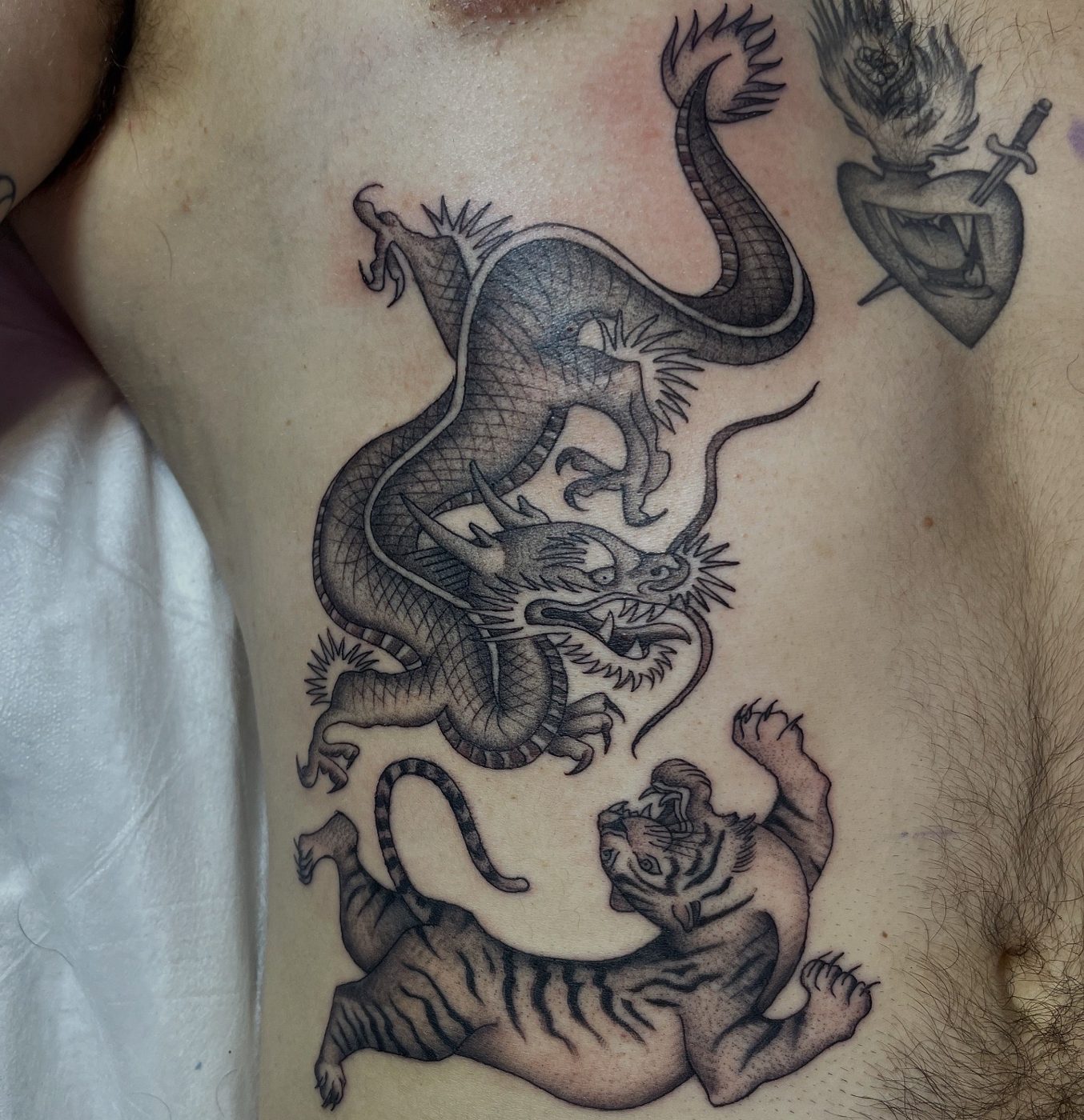
Dragon and tiger 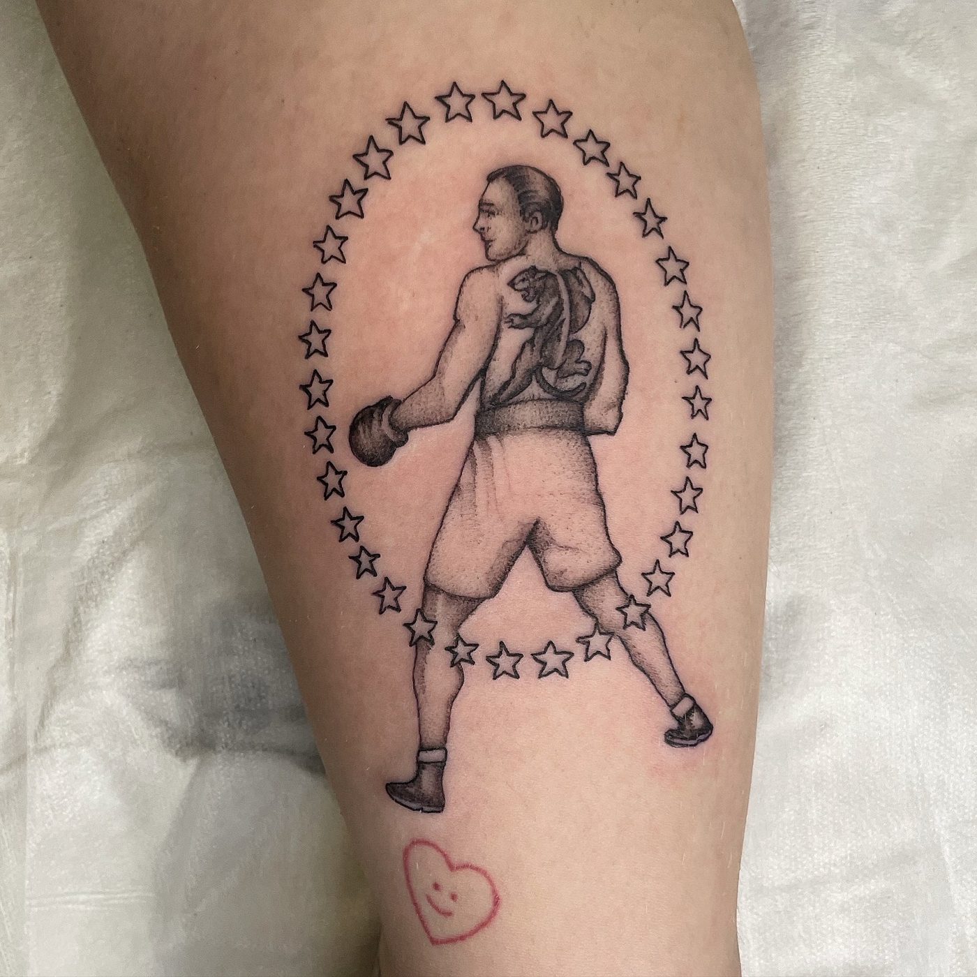
Boxer in a star arch 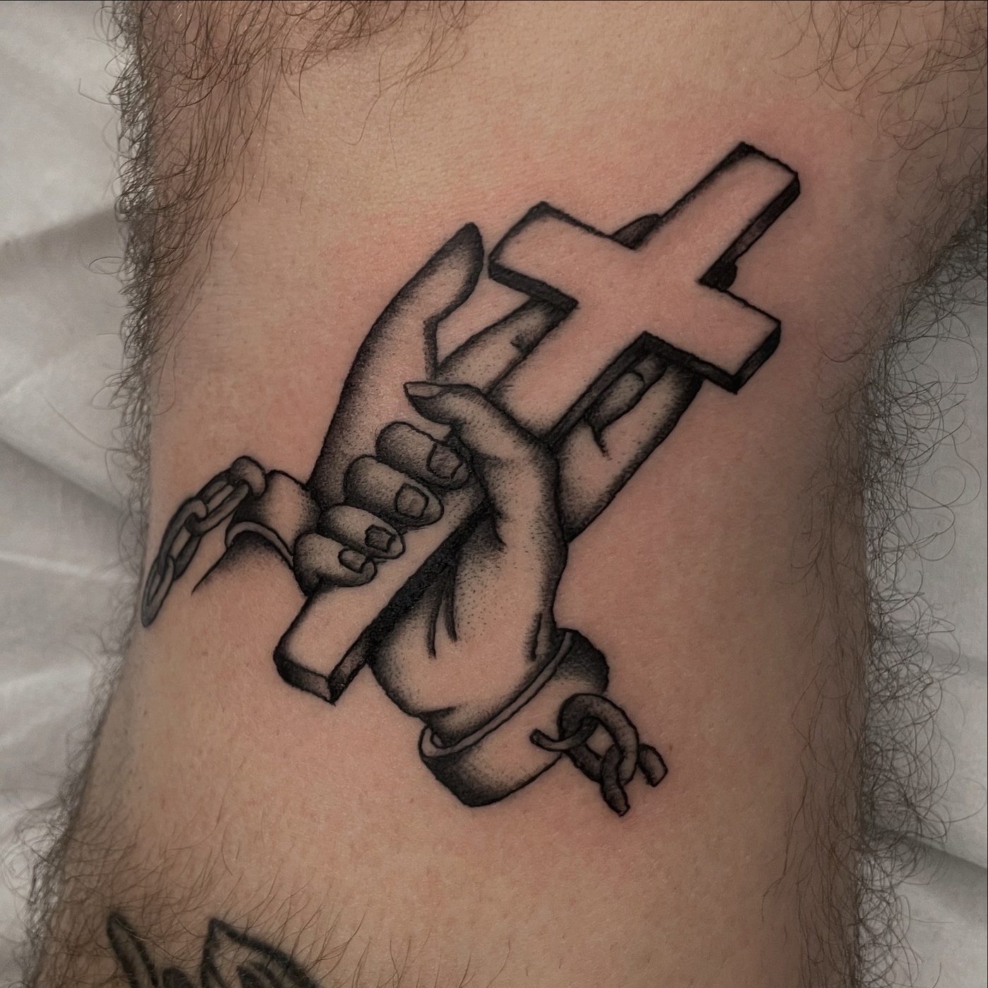
Hands and cross 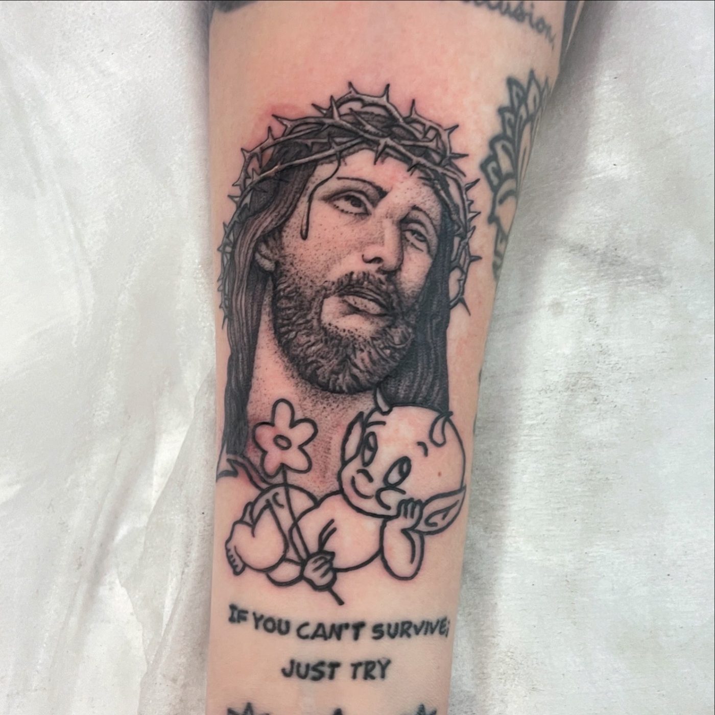
Jesus and cherub 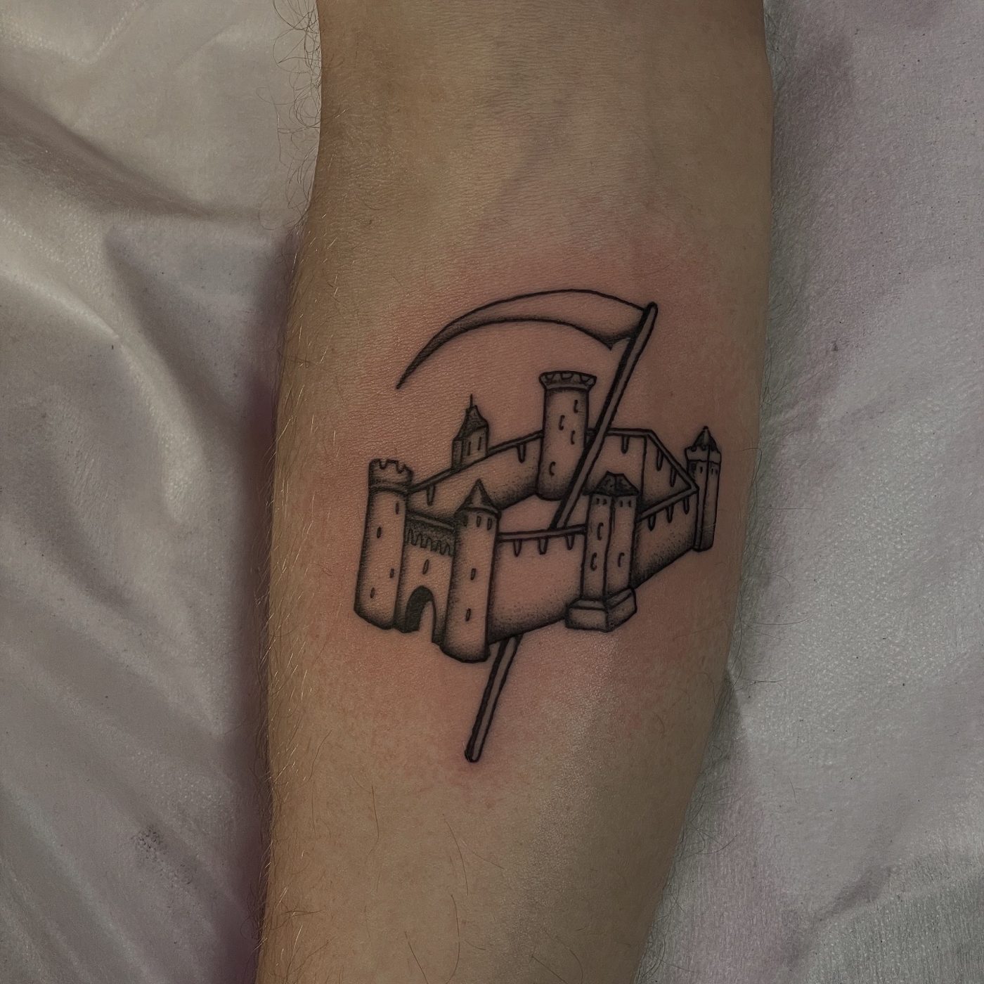
Castle and scythe
READY TO BOOK?
Send through your idea, rough placement and size, and you will get a reply with availability and a quote. You can also browse the flash book or head back to the portfolio.
Book a tattoo